Zusammenfassung
Leseprobe
Inhaltsverzeichnis
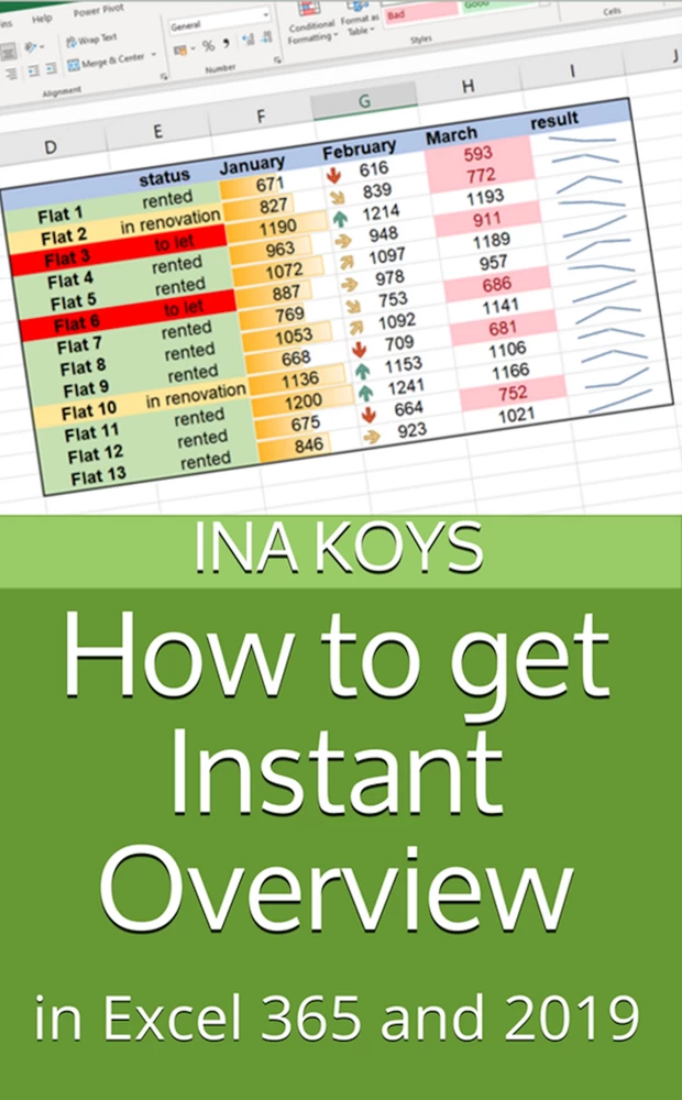
For many users Excel is a tool to check results of something. Sometimes, simple numbers can explain themselves, sometimes one wants to convert them into graphics. We will look at several ways to get this done.
This booklet is about optics. We will cover some calculation alongside, but not really in-depth. That will be done in a future booklet of this series.
All screen shots are done using Excel 365 in its current form. Like any other feature of Microsoft 365, they may gradually change in the future. In most of the cases, it won’t be a remarkable difference in Excel 2019. With an open eye, both versions will integrate nicely.
If you’d like to download the sample data, you can do so clicking
Enjoy your from now on more self-explaining workbooks!

Sheet names may not be rocket science, still are often ignored. It is not only about clearness of the screen view. They will also make it easier to understand relations and calculations.
One way to get a new sheet is clicking the Plus symbol on the right of the existing sheets. Any sheet can be renamed double-clicking the default name and typing in the new one. Then, to grant it the appropriate colour, right-click the sheet name again and pick a colour from the context menu. As long as the sheet is active, the selected colour will always appear somewhat pale. That’s normal and helps to keep overview.
If one then finds the line-up of sheets inconvenient or inappropriate, their order can always get changed with the left mouse button held down over the sheet name. Excel doesn’t care.
Not everything that for a human eye looks like a table is also a table from the point of Excel. As we begin to fill a worksheet with content and formattings, Excel regards this as a list or unstructured user input. Often, this would be totally alright.
In real life, one often has tables with a simple structure. If so, already the convenient visual features can save you a lot of work. Important in this case would be using table headers with only one row. Provided this, the table feature is the formatting way of choice. To apply it, click somewhere within the area of your future table. Then, from the Home tab, click Format as Table and select a design you like.
After that, you first get a window trying to make sure the correct range of cells and header were detected.

If not, you now have a last chance to correct the table range using your mouse pointer. Then, clicking OK the selected formatting is applied and Excel will understand from now on, that this is content with an inner correlation.
Clicking somewhere else, the currently still present grey table highlighting will disappear.

The main charm of the Table feature is indeed not only the look, but also the facilitation of calculations which are getting much easier. Details regarding that can be found in vol. 7 of this series, ‘Roll away the boring stuff’. Here, we are indeed only talking about looks. To test the different features that can be applied to a table, now click in a cell right below the table and type something. After pressing Tab or Enter the current formatting is applied for the whole row without you bothering.
If you now would like to highlight the first or last column of the table or remove the buttons of the filter, now have a look at the Table Design (Excel 2019: Table Tools / Design) tab. You only get this tab displayed if you previously clicked somewhere within the table. Otherwise, it will remain absolutely invisible - like any of all the so-called context sensitive tabs. We are going to see more of them in the upcoming chapters. If you are not yet familiar with these special tabs, now start to watch out for them. They are very helpful!
Also check out the other possibilities provided. Whether their effect is obvious depends on the design you selected. In that case, maybe pick a different template. They’re all in the same tab on the right.
In real life, tables and lists are most of the times much larger than the small ones used here as examples. Unless one finds a solution, only the upper or lower part of the sheet is visible. Or you can choose from the first bunch of columns or the last ones. But whenever required to keep an eye all the time on the far left or upper part of the sheet, it is strongly recommended to Freeze Panes.
To ensure this freezing really fits, first make sure that all unneeded rows and columns on the top and maybe left are out of sight and the first important content is the first you see in your window.
In this example, column A and rows 1-4 are scrolled away. The interesting content of the sheet begins in cell B5. My cell cursor is in C6. Anything now visible above and left of it is what I want to see all the time. To get it done, I select from the View tab Freeze Panes now. Not much seems to happen. But scrolling down, I see the difference.
I now can scroll down or to the right, the previously visible table header and the names remain on the screen. Everything above or left of the frozen area is invisible and stays so until I select Unfreeze Panes.
Using these freeze features work can become much more convenient. But do make sure all people involved are aware of the feature! I witnessed moments when people’s veins were white as they thought the momentarily invisible content was deleted!
As shown, these features are great for data on the beginning of a sheet. For any content on the right or bottom part you might be better off splitting the window.
Splitting the window is an alternative to the Freeze feature, it can’t be used simultaneously. In previous Excel versions, you therefore needed to remove any existing freeze; in the latest versions, Freeze will automatically get replaced by Split. You also find the button in the View tab.
In the upper left corner of your current cell cursor the window now is split. You can drag the lines wherever you like. But as mentioned before, the feature is best used at the end of the content of a sheet.
You now can have beginning and end of your sheet in one window. But indeed, the display with four scrollbars can be confusing, too. You therefore should find out whether all users can go along with that.
If you want to return to an unsplit view, simply click Split again.
For good reasons, the setup for the display on the screen is completely unlinked from the printout settings. And I do think that every user created some crappy sheets a couple of times at least in the beginning. But this can be prevented! There are several ways to get it done. Some go along with each other really well; others interfere with one another. We will here only use the most important ones.
First, let’s dig up an often-unexplored treasure of the View tab: the Page Layout View.
This view can alternatively also be activated in the bottom right part of the Excel window.
After that, the sheet is displayed dramatically different: exactly the way it would be printed. Using the Zoom function, you can adjust the display size to what suits you. If you like keyboard shortcuts, you also may hold down the CTRL key and turn your mouse wheel to zoom until you see your whole sheet on the screen.

The pages shown in white would be printed, the blueish or grey displayed ones wouldn’t. We can see here that the printout can do well will improvement. But at least, the printer would not deliver empty sheets.
The content to be printed is rather wide, so firstly, one should print it in landscape mode. To do so, go to Page Layout / Page setup / Orientation. Doing so, our example would consume 2 pages less. That’s a good beginning.
The overview on printed sheets is still improvable. Only page 1 shows all the information needed: headers and names in the first column. We want them on all the pages so as one does not need to glue them together only to find out which is which. To get this done, we have Print Titles. Using them, we can define the rows and columns to be displayed on each printed sheet.
In the dialogue opening now, you can specify your desired columns and rows in the Print Titles area. It’s done easiest first to activate an input field and then to click in the excel sheet on the row and column names, i.e., ‘1’ and ‘A’. Alternatively, you can of course type them in using the correct range like $1:$1.
Now clicking OK you’ll get the result on the screen: Row 1 and column A will be printed on all pages. For most of the times, this will do. Maybe I will go into more detail in another booklet.
Anyway, if you want to switch back to the Normal view, you can do that in the View tab. But you don’t need to. The Page Layout View supports any Excel task you may want to perform. You can use it all the time to keep ongoing control of what the print would look like.
